Use less text on mobile!
EXACTLY WHAT YOU NEED
EVERYTHING CUSTOMIZABLE
Use less text on mobile!
FEEL THE LUXURY
CONTACT US TO GET A QUOTE AS YOU NEED
EXACTLY WHAT YOU NEED
EVERYTHING CUSTOMIZABLE
CONTACT US & GET YOUR QUOTE
FEEL THE LUXURY
By Xactz Packaging
Jul 4, 2026
Add a comment
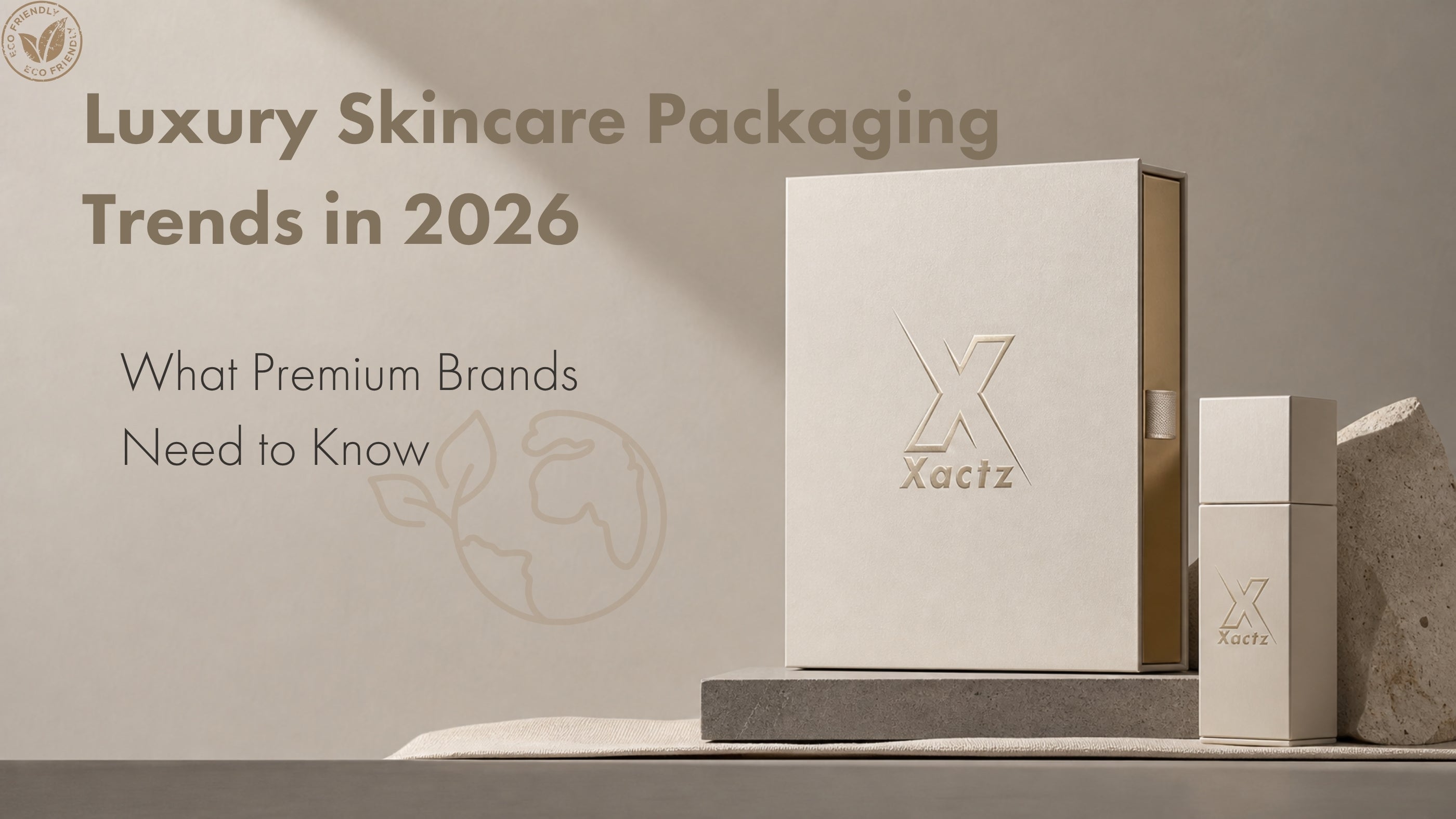
Skincare packaging in 2026 is required to do two things simultaneously that have historically been in tension with each other.
It must communicate clinical credibility and premium luxury at the same moment, in the same object, to the same customer. The brands that are winning in this category have understood that these two signals are not opposites. They are complementary. A rigid box with a controlled magnetic open, a paper tray insert that holds each product in precise alignment, and a restrained finish combination of soft-touch matte with a single gold foil brand mark communicates both the rigour of a clinical formulation and the care of a luxury brand.
Skincare is the single largest category driving luxury packaging demand globally in 2026. The rigid boxes market was valued at USD 31.2 billion in 2025 and is projected to grow at a CAGR of 4.6% through 2035, with beauty and skincare identified as the primary growth driver. The brands investing in premium packaging are not doing so for aesthetic reasons alone. They are doing so because packaging is the first physical proof point of a product's quality, and in a category where the formulation is invisible until the product is used, the packaging carries the entire burden of the first impression.
This guide covers the specific formats, material choices, finish combinations, and insert systems that work for serums, moisturisers, eye creams, and skincare gift sets in 2026.
The defining packaging challenge in skincare is the clinical-luxury balance. Clinical packaging signals efficacy, precision, and scientific rigour. Luxury packaging signals care, investment, and premium quality. The brands that fail in this category tend to fall too far in one direction.
A packaging system that reads as purely clinical, stark white, minimal, no finish, no tactile detail, communicates that the brand has prioritised the formulation over the experience. This is a legitimate positioning for pharmaceutical-grade skincare, but it leaves brand equity on the table for premium and prestige brands. A packaging system that reads as purely luxurious, heavy embellishment, maximum foil coverage, ornate structural details, communicates that the brand has prioritised the experience over the formulation. This works in fragrance and gifting, but it undermines the credibility signal that skincare customers require.
The correct approach is a restrained luxury system. Clean structural forms. Precise, controlled finishes. A single dominant premium detail, a foil brand mark, a soft-touch lamination, a magnetic closure, that communicates investment without overwhelming the clinical signal. This is the packaging language of the brands leading the prestige skincare category globally in 2026.
Different skincare product types have different packaging format requirements, driven by the physical dimensions of the primary packaging, the retail and gifting context, and the brand positioning signals the secondary packaging needs to carry.
Serums are typically housed in glass dropper bottles or pump bottles with a narrow footprint and a tall profile. The secondary packaging for a serum is most commonly a single-product rigid box with a close-fitting paper tray insert that holds the bottle upright and prevents movement during transit. The box height should allow the bottle to sit slightly below the rim of the box when the tray is in place, so that the product is revealed progressively as the lid is lifted rather than visible immediately. This controlled reveal is one of the most effective unboxing mechanics in skincare packaging.
Moisturisers are typically housed in glass jars or airless pump bottles with a wider footprint and a lower profile. The secondary packaging for a moisturiser is most commonly a single-product rigid box with a paper tray insert engineered to the specific diameter of the jar or bottle. For premium moisturisers, the box base depth should be calibrated so that the product sits at a height that allows the lid to clear the product without resistance when opened, creating a smooth, controlled open that communicates precision manufacturing.
Eye creams are among the smallest primary packaging formats in skincare, typically housed in glass jars or metal tubes with a very small footprint. The secondary packaging for an eye cream is most commonly a single-product rigid box with a deep paper tray insert that holds the small primary pack securely and prevents it from moving within the box. The small scale of the primary packaging makes the secondary packaging proportionally more important as a brand signal, and the finish and material quality of the box carries more of the premium positioning weight than in larger product formats.
Skincare gift sets require a multi-product rigid box format with a paper tray insert system engineered to hold multiple primary packs in a defined layout. The insert system must hold each product securely in its designated position, prevent contact between products during transit, and present the full set in a visually composed arrangement when the box is opened. The gift set box is the most complex skincare packaging format and the one that offers the greatest opportunity for brand expression through structural design, insert configuration, and finish combination.
The rigid box with paper tray insert is the industry standard format for premium skincare secondary packaging, and for good reason. It is the format that most effectively combines the structural premium signal of a rigid box with the product presentation precision of a custom-engineered insert system.
The rigid box component is constructed from a greyboard core wrapped in a chosen material, typically art paper, textured wrap paper, or leatherette, with the brand's chosen finish applied to the outer surface. The box uses a lid and base construction with a magnetic closure for premium applications, or a friction-fit lid for more restrained positioning. The weight and rigidity of the greyboard core communicates quality at the moment of first contact, before the box is opened.
The paper tray insert is a separate structural component, constructed from a lighter board and wrapped in a coordinating material, typically the same wrap paper as the box interior or a contrasting colour. The tray is engineered to the precise dimensions of the primary packaging it holds, with cutouts or raised platforms that position each product at a defined height and prevent lateral movement. The wrap material of the tray insert is the interior surface the customer sees when the box is opened, making it a critical brand expression surface.
The combination of the rigid outer box and the precision paper tray insert creates a packaging system that communicates both the investment of the brand and the care with which the product has been prepared for the customer. The product sits in its designated position, held securely and presented precisely, communicating that every detail of the experience has been considered.
For skincare brands, the paper tray insert is available in several configurations. A flat tray with die-cut product wells is the most common configuration for single-product boxes, providing a clean, minimal presentation surface. A stepped tray with multiple platform heights is used for gift sets where products of different heights need to be presented at a consistent visual level. A tray with a ribbon lift system adds a pull-tab that allows the customer to lift the tray and the product out of the box in a single, deliberate motion, adding a layer of ritual to the unboxing experience.
The material choices for skincare packaging must support both the clinical and luxury signals the packaging is required to carry. The wrong material choice undermines one or both signals regardless of the quality of the structural design and finish.
Art paper is the most widely used wrap material for premium skincare packaging. It is available in a wide range of weights, textures, and surface finishes, and accepts all standard finishing techniques including foil stamping, embossing, debossing, and spot UV. A smooth, coated art paper in white or cream communicates clinical precision and is the correct choice for brands whose positioning is built on scientific credibility. A lightly textured art paper in the same colour range adds a tactile dimension that shifts the signal toward considered luxury without abandoning the clinical foundation.
Soft-touch laminated board is the material combination that most effectively delivers the clinical-luxury balance in skincare packaging. The soft-touch lamination creates a velvety, non-reflective surface that communicates premium quality through tactile experience rather than visual embellishment. Applied over a white or pale base colour, soft-touch lamination creates a surface that reads as both clinically clean and luxuriously tactile. It is the most specified surface treatment in prestige skincare packaging globally and the one that most consistently delivers a premium first impression at the moment of unboxing.
Textured wrap papers including linen, laid, and wove finishes add a natural, artisanal quality to skincare packaging that is particularly effective for botanical, organic, and clean beauty brands. The texture communicates provenance and natural quality, and pairs effectively with copper or rose gold foil finishes that reinforce the warm, natural brand positioning.
Leatherette and vegan leather wraps are used for ultra-premium skincare packaging where the tactile experience needs to communicate the highest level of luxury investment. They are most commonly specified for limited edition packaging, premium gift sets, and hero product boxes where the packaging is intended to be retained and reused by the customer.
The finish combination is the most visible brand expression decision in skincare packaging, and the one that most directly determines whether the packaging reads as clinical, luxury, or the correct combination of both.
Soft-touch matte with gold foil brand mark is the defining finish combination of prestige skincare packaging in 2026. The velvety, non-reflective base of the soft-touch lamination creates the maximum possible contrast with the metallic reflectivity of the gold foil, amplifying the visual impact of the foil stamp while maintaining the clean, restrained surface character that communicates clinical credibility. This combination works across all skincare product types and all brand colour palettes, and is the recommended starting point for any skincare brand entering the premium packaging category.
Soft-touch matte with rose gold foil brand mark is the contemporary beauty variant of the above combination, substituting rose gold for gold to shift the brand personality signal from heritage authority to contemporary warmth. It is the most specified finish combination in premium skincare targeting a female consumer demographic aged 25 to 45, and consistently performs as one of the most photographed packaging finishes in skincare unboxing content across social media platforms.
Gloss lamination with embossed brand mark is the clinical precision combination, communicating scientific rigour and product quality through a clean, reflective surface and a precisely defined three-dimensional brand mark. It is the correct choice for brands whose positioning is built on clinical efficacy and whose customer is motivated primarily by formulation credentials rather than lifestyle aspiration.
Soft-touch matte with debossed brand mark and no foil is the restraint combination, communicating quiet confidence and considered luxury through texture and form rather than reflectivity. It is the correct choice for ultra-premium brands whose positioning is built on exclusivity and whose customer does not need the validation of a visible premium signal. The debossed brand mark is visible as a shadow in the surface of the soft-touch lamination, revealing itself only under raking light, communicating that the brand has invested in detail that most customers will never fully notice.
Matte lamination with spot UV brand mark is the precision contrast combination, creating a high-gloss brand element on a non-reflective base. It is a cost-effective alternative to foil stamping that delivers a strong visual contrast and is particularly effective for brands with complex logo artwork that would be difficult or expensive to execute in foil.
The skincare gift set box is the highest-value packaging format in the category and the one that offers the greatest opportunity for brand expression and customer experience design.
A premium skincare gift set box must achieve four things simultaneously. It must present the full product set in a visually composed, immediately legible arrangement when opened. It must hold each product securely in its designated position throughout the logistics chain without any movement, contact between products, or damage to primary packaging. It must communicate the value of the set through the quality of the box construction, the precision of the insert system, and the sophistication of the finish combination. And it must create an unboxing experience that the customer associates with the brand and is motivated to share.
The recommended format for a premium skincare gift set is a rigid lid and base box with a magnetic closure, a stepped paper tray insert system that presents each product at a consistent visual height, and a ribbon lift system that allows the customer to remove the tray and products in a single deliberate motion. The outer box surface carries the primary brand finish combination. The interior of the box and the tray insert surface carry a coordinating colour and material that creates a composed, intentional interior environment rather than a functional holding system.
For gift sets that include products of significantly different heights, a two-level insert system can be used, with taller products positioned at the back of the box and shorter products at the front, creating a tiered presentation that allows every product to be visible when the box is opened. This configuration is particularly effective for sets that combine a serum, a moisturiser, and an eye cream, where the height differential between the three primary packs is significant.
Seasonal and limited edition gift set packaging benefits from a structural upgrade to the standard format, adding a belly band, a tissue paper layer, or a printed interior base card that adds a layer of ritual to the unboxing experience and communicates that the set has been prepared with deliberate care.
Colour is the most immediate brand signal in skincare packaging and the one that most directly determines the clinical-luxury balance of the finished box.
White and off-white base colours are the most widely specified in prestige skincare packaging because they communicate clinical precision and cleanliness while providing a neutral base that allows finish combinations to read with maximum clarity. A white soft-touch matte box with a gold foil brand mark is the canonical prestige skincare packaging combination precisely because the white base carries the clinical signal and the gold foil carries the luxury signal in a clean, unambiguous visual hierarchy.
Black base colours communicate exclusivity and confidence, and are most effective for ultra-premium and niche skincare brands whose positioning is built on scarcity and editorial sophistication rather than clinical accessibility. A black soft-touch matte box with a rose gold or pale gold foil brand mark is one of the most visually impactful combinations in prestige skincare packaging and is increasingly specified by brands entering the ultra-premium segment.
Pale neutral base colours including blush, nude, sage, and warm grey communicate contemporary warmth and lifestyle aspiration, and are most effective for clean beauty, botanical, and wellness-positioned skincare brands. These base colours pair most effectively with rose gold or copper foil finishes that reinforce the warm, natural brand personality.
Deep jewel tone base colours including forest green, navy, and burgundy communicate heritage, provenance, and ingredient quality, and are most effective for brands whose positioning is built on a specific hero ingredient or geographic provenance. These base colours pair most effectively with gold or champagne gold foil finishes that reinforce the premium, heritage brand signal.
The unboxing sequence is the choreography of the customer's physical interaction with the packaging, from the moment they pick up the box to the moment they hold the product in their hands. For premium skincare packaging, the unboxing sequence is a brand experience in its own right and should be designed with the same deliberateness as the visual design of the packaging surface.
The sequence begins with the weight and feel of the closed box. A rigid box with a greyboard core of appropriate weight communicates quality at the moment of first contact. The box should feel substantial without feeling heavy, communicating investment without suggesting excess.
The magnetic closure is the first active moment in the sequence. The resistance of the magnet as the lid is lifted, and the controlled release as the magnet disengages, communicates precision manufacturing and deliberate design. The closure should require a small but perceptible effort to open, confirming that the box has been engineered to stay closed rather than simply resting shut.
The reveal of the interior is the most important moment in the sequence. The product should be visible immediately upon opening, held in its designated position in the paper tray insert, presented at a height and angle that communicates care and intention. If a ribbon lift system is used, the ribbon should be positioned at the front of the tray, visible as soon as the box is opened, inviting the customer to engage with the next step of the sequence.
The removal of the product from the tray should require a deliberate action, either lifting the ribbon to raise the tray, or lifting the product directly from its well. The product should release cleanly from the insert without resistance, confirming that the insert has been engineered to the precise dimensions of the primary packaging.
Several common packaging decisions undermine the clinical-luxury balance in skincare packaging and should be avoided regardless of budget constraints.
Foam inserts are the most common material downgrade in skincare packaging and the one that most immediately signals a budget constraint to the customer. Foam communicates functional protection rather than considered presentation. A paper tray insert at a comparable cost communicates precision and care. Always specify paper tray inserts for premium skincare packaging.
Gloss lamination on a white base creates a surface that reads as cosmetic rather than clinical or luxury. It is the finish most associated with mass-market beauty packaging and the one that most clearly signals a mid-market positioning. Avoid gloss lamination on white for any brand with a premium or prestige positioning.
Full-coverage foil is the finish error most commonly made by brands entering the premium packaging category for the first time. Foil is most effective as a precise, restrained accent applied to a single brand element. Full-coverage foil on a box surface communicates excess rather than luxury, and undermines the clinical credibility signal that skincare packaging requires.
Generic box dimensions that do not match the primary packaging create movement within the box during transit, resulting in product damage, surface marks on the primary packaging, and an unboxing experience that communicates carelessness rather than precision. Always engineer the box and insert dimensions to the specific primary packaging dimensions of the product.
A complete skincare packaging brief covers the primary packaging dimensions for every product in the range or set, specified in millimetres with tolerances. The box format, lid and base rigid box, foldable rigid box, or folding carton. The insert type, flat paper tray, stepped paper tray, or ribbon lift tray. The wrap material and base colour for the outer box and the interior tray. The finish combination for the outer box surface, specifying lamination type, foil colour by reference number, and any emboss or deboss elements. The closure type, magnetic or friction-fit. And the approval process, confirming that a white mockup will be produced to verify dimensions and insert fit before any finishing is applied.
The white mockup stage is non-negotiable for skincare packaging. The dimensional relationship between the box, the insert, and the primary packaging must be verified physically before any production commitment is made. A primary packaging dimension error discovered at the white mockup stage costs a sample revision. The same error discovered after a production run costs the entire run.
Xactz is a verified direct manufacturer specialising in luxury skincare packaging across all formats, from single-product serum boxes to multi-product gift set systems. Our in-house capability covers rigid lid and base boxes, foldable rigid boxes, and folding cartons, all with custom paper tray insert systems engineered to the precise dimensions of your primary packaging.
Every skincare packaging project at Xactz begins with a dimensional review of your primary packaging and a white mockup that confirms box dimensions, insert fit, product reveal height, and closure performance before any surface finishing is applied. Our golden sample process ensures that every unit in the production run matches the approved sample across all finish, colour, and structural specifications.
We offer the complete range of surface treatments for skincare packaging including soft-touch matte lamination, gloss and matte foil stamping in all colours, embossing, debossing, spot UV, and multi-technique combination finishes. All finishing is applied in-house across our 40,000 square metre production facility in Shenzhen and Huizhou, China, with a team of 300 plus specialists delivering fully custom packaging in 10 to 18 days from sample approval. FSC certified. ISO 9001 certified. TUV Rheinland verified.
By Xactz Packaging
Aug 16, 2026
By Xactz Packaging
Aug 13, 2026
By Xactz Packaging
Aug 12, 2026
