Most brand managers treat logo placement on packaging as a design decision. It is not. It is a manufacturing decision that happens to have design consequences, and getting it wrong costs money, time, and brand equity at the exact moment a customer is forming their first physical impression of your product.
A logo that is too large overwhelms the packaging surface and reads as insecure. A logo supplied in the wrong file format delays production by weeks. A foil stamp specified on a gloss laminate surface produces a finish that looks cheap rather than premium. A deboss specified on a thin paper wrap warps the substrate and destroys the structural integrity of the box.
None of these are design problems. They are specification problems. And every one of them is preventable if the brief is built correctly from the start.
This guide covers every decision a brand manager needs to make when designing a gift box with a logo: why logo placement is a strategic decision, the four application methods and which surfaces each works on, the file format requirements for each method, the most common mistakes and how to avoid them, and the golden sample process that confirms the logo is correct before a single production unit is made.
Table of Contents
Why Logo Placement Is a Strategic Decision, Not a Design One
The logo on a gift box is not decoration. It is the primary brand signal at the highest-attention moment in the customer relationship. The moment a customer picks up a gift box, before the lid is opened, before the product is seen, the logo communicates everything the brand wants them to believe about what is inside.
That communication is determined by three variables: placement, scale, and application method. Each of these variables is a manufacturing specification, not a design preference. The placement determines which panel of the box the logo sits on and how it relates to the structural geometry of the format. The scale determines the relationship between the logo and the surface area of the panel it occupies. The application method determines the tactile and visual language the logo speaks.
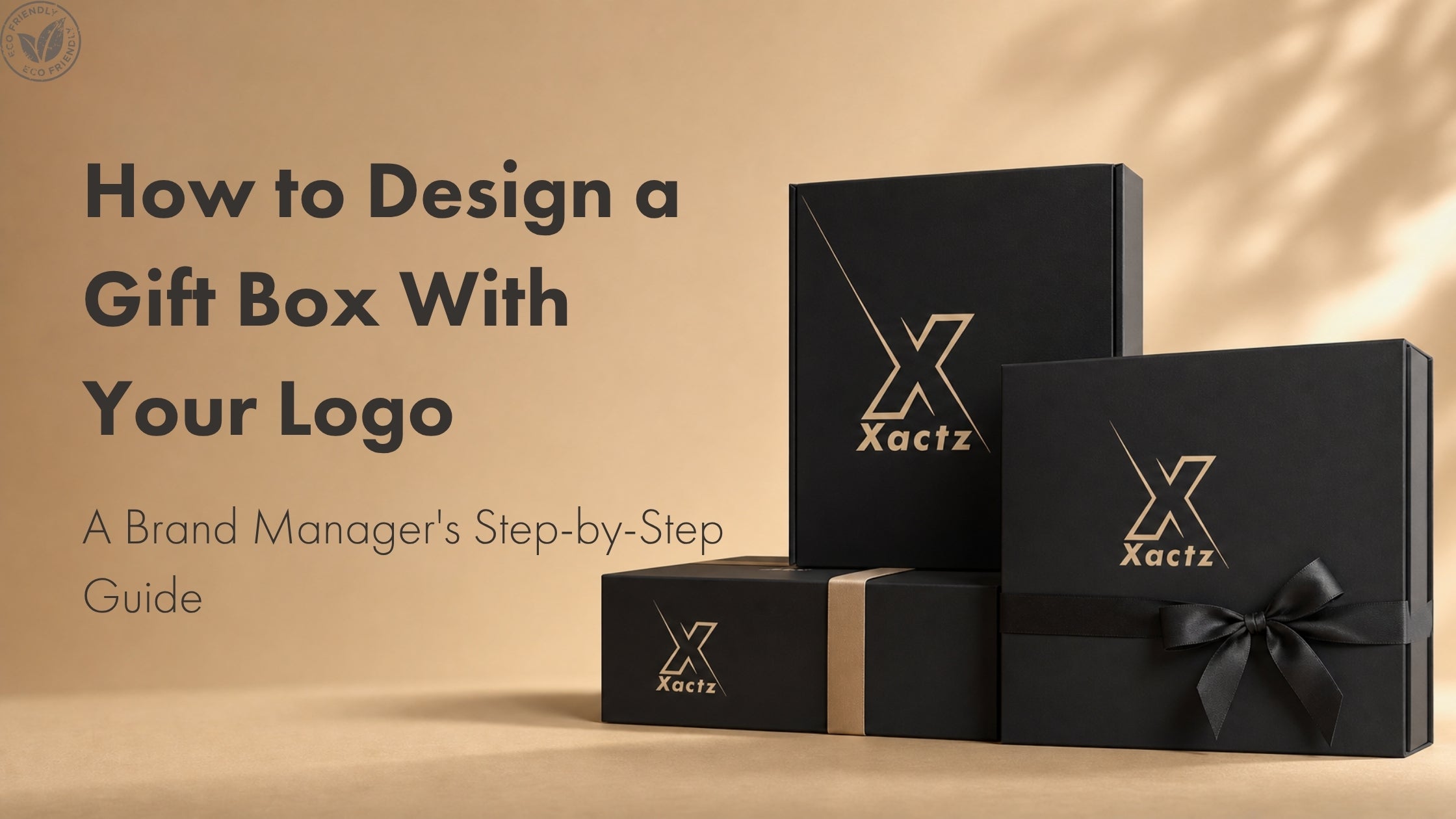
A logo placed on the centre of the lid panel, scaled to occupy 30 to 40 percent of the panel width, applied as a blind deboss on soft-touch matte lamination, communicates restraint, confidence, and premium quality. The same logo placed at the same scale, applied as a full-colour CMYK print on a gloss laminate surface, communicates something entirely different. The brand identity has not changed. The manufacturing specification has. And the customer's perception of the brand changes with it.
This is why logo placement decisions must be made in conversation with the manufacturer, not handed off to a graphic designer working in isolation. The designer can create a beautiful artwork file. Only the manufacturer can confirm whether that artwork file is compatible with the surface, the application method, and the structural format of the box being produced.
The 4 Logo Application Methods for Gift Boxes
There are four primary logo application methods used on premium gift boxes. Each produces a different visual and tactile result, carries different setup costs, requires different file formats, and performs differently on different surface finishes.
Method 1: CMYK and Pantone Print
Direct printing applies ink to the surface of the paper wrap before or after it is applied to the board structure of the box. CMYK printing uses four ink layers, cyan, magenta, yellow, and black, to reproduce full-colour artwork. Pantone printing uses a single pre-mixed ink to reproduce a specific colour with precision that CMYK cannot match.
For logo application on gift boxes, Pantone printing is the standard for brand colour accuracy. CMYK printing introduces colour variation that is acceptable for photographic imagery but not for brand marks where a specific colour is part of the brand identity. If your logo has a defined Pantone colour, specify it as a Pantone colour, not a CMYK conversion.
Print is the most versatile application method. It works on any surface finish, accommodates full-colour artwork, and has the lowest setup cost of the four methods because it does not require die fabrication. It is the correct method for complex logos with multiple colours, gradient elements, or fine detail that cannot be reproduced by a physical die.
Method 2: Hot Foil Stamping
Hot foil stamping applies a metallic or pigmented foil to the surface of the box using a heated metal die pressed onto a thin foil layer. The heat and pressure cause the foil to adhere to the surface in the exact shape of the die. When the die is lifted, the foil remains on the surface in a reflective, shiny finish that instantly communicates luxury.
Common foil colours for logo application on gift boxes are gold, silver, rose gold, copper, and holographic. Matte foils in black, white, and brand colours are also available for brands that want the visual contrast of foil without the reflective finish.
Hot foil stamping is the most widely used premium logo application method in the gift packaging industry. It catches light, photographs exceptionally well, and creates a visual signal of quality that print cannot replicate. It requires a custom metal die for each logo, which adds a one-time setup cost to the order. That setup cost is amortised across the production run and becomes negligible at volumes above 500 units.
The critical specification constraint for foil stamping is minimum line weight. Fine lines below 0.5pt and small text below 6pt do not reproduce reliably in foil because the die cannot hold that level of detail under heat and pressure. Logos with very fine detail should be reviewed by the manufacturer before a die is commissioned.
Method 3: Embossing
Embossing raises the logo above the surface of the packaging material, creating a three-dimensional tactile effect. The design is pressed upward using a metal die and counter die, typically with heat and pressure. The result is a logo that catches light and shadow, adding dimension and sophistication to the packaging surface.
Embossing can be applied with or without ink or foil. Blind embossing, which uses no additional colour, creates a subtle, tonal effect where the logo is visible through the play of light and shadow rather than through colour contrast. Registered embossing combines the raised effect with a foil or ink layer applied to the raised surface, creating a logo that is both tactile and visually prominent.
Embossing is the application method associated with traditional luxury and artisanal brand positioning. It communicates craft and investment. It is particularly effective on uncoated and lightly textured paper wraps where the raised surface creates a strong visual contrast with the surrounding texture.
The specification constraint for embossing is material thickness. Thin paper wraps below 100gsm can wrinkle or warp under the pressure of the embossing die. The manufacturer must confirm the paper weight is compatible with the emboss specification before production begins.
Method 4: Debossing
Debossing is the reverse of embossing. The logo is pressed into the surface, creating an indented, recessed impression. The design sinks below the surface level, creating a quiet sense of depth and elegance that is distinctly different from the prominence of embossing.
Blind debossing, applied without ink or foil, is the application method most associated with the quiet luxury aesthetic that is defining premium packaging in 2026. The logo is felt before it is seen. On a soft-touch matte surface, a blind debossed logo creates a tactile depth that no printed or foil finish can replicate. It is the specification for brands positioning at the ultra-premium end of the market where restraint is the signal of confidence.
Debossing works well with thicker materials and produces a cleaner finish on both sides of the material than embossing, because the impression sinks into rather than pushing through the substrate. It pairs exceptionally well with soft-touch matte lamination, linen-effect textures, and uncoated kraft surfaces.
Which Application Method Works on Which Surface Finish
The relationship between application method and surface finish is where most logo specification errors occur. Not every method works on every surface. Specifying the wrong combination produces a result that looks inferior to what either the method or the finish would produce independently.
Foil stamping performs best on matte and soft-touch matte surfaces. The contrast between the reflective foil and the flat matte surface creates the strongest visual impact. Foil on gloss lamination produces a finish where the foil and the surrounding surface have similar reflective qualities, which reduces the contrast and diminishes the premium signal. If your box specification includes gloss lamination and you want a foil logo, specify a matte lamination for the panel where the logo sits, or reconsider the surface finish.
Debossing performs best on soft-touch matte lamination and uncoated surfaces. The soft-touch surface amplifies the tactile quality of the deboss, creating a velvet-like texture around the recessed logo that communicates premium quality on contact. Debossing on gloss lamination produces a less defined impression because the laminate layer resists the die pressure more than an uncoated surface.
Embossing performs best on uncoated and lightly textured paper wraps. The raised surface creates the strongest visual contrast on a textured background where the smooth raised area reads clearly against the surrounding texture. On heavily coated or laminated surfaces, the emboss impression is less defined.
Spot UV performs best on matte lamination. The high-gloss UV coating applied to the logo area creates a strong contrast against the flat matte surface. Spot UV on gloss lamination produces no visible contrast because both surfaces have similar gloss levels.
CMYK and Pantone print work on any surface finish but produce the most accurate colour reproduction on coated surfaces. On uncoated and kraft surfaces, ink absorbs into the paper fibres, which can cause colour shift and reduced saturation. If your logo requires precise colour accuracy on an uncoated surface, specify a Pantone colour and confirm the expected colour shift with the manufacturer before production.
File Format Requirements for Each Application Method
Supplying the wrong file format is the single most common cause of production delays in logo application. Every application method has specific file format requirements, and a file that is acceptable for one method is often unusable for another.
The universal requirement across all four methods is that the logo artwork must be supplied as a vector file. Vector files define the logo as mathematical paths rather than pixels, which means they can be scaled to any size without loss of quality. Raster files, including JPEG, PNG, and low-resolution PDF, cannot be used for die fabrication or precision print registration because they pixelate when scaled.
The accepted vector file formats are AI (Adobe Illustrator), EPS (Encapsulated PostScript), and high-resolution PDF with embedded vector paths. CDR (CorelDRAW) files are accepted by some manufacturers. All text within the file must be converted to outlines before submission, which converts the text from an editable font into a fixed vector path. This prevents font substitution errors when the file is opened on a system that does not have the same fonts installed.
For foil stamping and embossing or debossing, the artwork file must be a single-colour vector. The die is fabricated from the outline of the logo, not from its colour information. Supply the logo as a solid black shape on a white background, with all elements that will be foiled or pressed as a single unified path. Fine lines should be checked against the minimum line weight specification for the chosen method before the file is submitted.
For CMYK print, supply the full-colour artwork file with all colours specified in CMYK values or Pantone codes. RGB colour profiles must be converted to CMYK before submission because RGB colours cannot be reproduced accurately in print. The colour shift between RGB and CMYK can be significant for certain colours, particularly bright blues, greens, and oranges. Confirm the CMYK values with the manufacturer and request a colour proof before approving the print specification.
For Pantone print, specify the Pantone Matching System code for each colour in the logo. Confirm whether the Pantone colour is being matched in coated or uncoated stock, as the same Pantone code produces different results on different surfaces.
The Most Common Logo Mistakes on Packaging
The mistakes that most frequently result in production delays, reprints, and brand quality failures in logo application on gift boxes fall into five categories.
Oversized logos are the most common aesthetic mistake. A logo that occupies more than 50 percent of the panel width overwhelms the packaging surface and communicates insecurity rather than confidence. The standard specification for a primary logo on a gift box lid panel is 30 to 40 percent of the panel width, centred, with equal visual weight on all sides. Logos for secondary panels, side walls, and interior surfaces should be scaled proportionally smaller to create a hierarchy of brand presence across the box structure.
Wrong colour profiles are the most common technical mistake. Supplying artwork in RGB for a CMYK print job is the single most frequent cause of colour inaccuracy in packaging production. The manufacturer's prepress team will convert RGB files to CMYK before printing, but the conversion algorithm they use may not match the colour intent of the original design. Always convert to CMYK and confirm the values before submission.
Wrong file types are the second most common technical mistake. Supplying a high-resolution JPEG or PNG instead of a vector file is not a minor inconvenience. It stops production. The manufacturer cannot fabricate a die from a raster file. They cannot guarantee print registration from a raster file. The production timeline does not begin until a usable vector file is received.
Text not converted to outlines is a mistake that is invisible in the artwork file and only becomes apparent when the file is opened at the manufacturer. If the font used in the logo is not installed on the manufacturer's system, the text reverts to a default font and the logo changes shape. Convert all text to outlines before submitting any artwork file for packaging production.
Specifying foil on gloss lamination is the most common finish compatibility mistake. As covered in section three, foil on gloss produces a low-contrast result that looks inferior to foil on matte. If the brief specifies gloss lamination and foil logo, the manufacturer should flag the compatibility issue. If they do not, the brand manager should raise it.
The Golden Sample Process for Logo Verification
The golden sample is the physical reference standard for a packaging production run. It is a single unit, or a small set of units, produced to the full specification of the order, approved by the brand, and retained by both the brand and the manufacturer as the quality benchmark against which every production unit is measured.
For logo application, the golden sample process is non-negotiable. No amount of digital proofing, colour matching software, or artwork approval can substitute for holding the physical sample and confirming that the logo looks and feels correct on the actual surface, in the actual application method, at the actual scale specified.
The golden sample process for a gift box with logo application typically runs as follows. The brand submits the artwork file and the full box specification. The manufacturer reviews the artwork for technical compatibility with the specified application method and surface finish, and flags any issues before production begins. A pre-production sample is produced and shipped to the brand for approval. The brand reviews the sample against the specification and either approves it or requests revisions. Once approved, the golden sample is signed off and retained as the production reference. Production begins.
The golden sample cycle adds time to the production timeline, typically two to three weeks from artwork submission to sample approval. This time must be built into the planning calendar. A brand that submits artwork expecting production to begin immediately will be disappointed. A brand that builds the golden sample cycle into its timeline will receive production units that match the approved standard on every unit.
At Xactz, the golden sample process is included in every order. No production run begins without an approved physical sample. The approved sample is retained at the Xactz facility for the duration of the production run and referenced at every quality control checkpoint in the 18-point QC process.
How Xactz Handles Logo Application from MOQ 100
Xactz manufactures custom logo gift boxes from MOQ 100 units across all four logo application methods: CMYK print, Pantone print, hot foil stamping, emboss, deboss, and spot UV. All methods are available as standalone specifications or in combination, for example foil stamp over deboss, or spot UV over soft-touch matte.
Every order includes a pre-production artwork review, golden sample production and approval, and an 18-point in-house quality control process that checks logo placement, finish quality, and colour accuracy at multiple stages of production. FSC Chain of Custody certification SGS-COC-332603 is standard across all board materials. PFAS-free lamination options are available across all surface finishes.
Xactz operates from 40,000sqm of production facilities with ISO 9001:2015 quality management certification, TÜV Rheinland verification, FDA compliance, and EU 94/62/EC certification. Factory-direct pricing with no broker margin. Every logo specification confirmed by physical golden sample before a single production unit is made.
Submit your logo file and box specification for a free placement consultation. The Xactz technical team will review your artwork, confirm compatibility with your chosen application method and surface finish, and advise on any adjustments required before the golden sample process begins.
Submit your logo for a free placement consultation: https://xactz.com/pages/contact-us
Explore Xactz custom logo gift boxes: https://xactz.com/