Use less text on mobile!
EXACTLY WHAT YOU NEED
EVERYTHING CUSTOMIZABLE
Use less text on mobile!
FEEL THE LUXURY
CONTACT US TO GET A QUOTE AS YOU NEED
EXACTLY WHAT YOU NEED
EVERYTHING CUSTOMIZABLE
CONTACT US & GET YOUR QUOTE
FEEL THE LUXURY
By Xactz Packaging
Aug 6, 2026
Add a comment
Something significant is happening on the shelves of premium retail.
The loudest packaging in the room is no longer the most desirable. Brands that once competed on graphic complexity, foil saturation, and maximum visual noise are quietly losing ground to a new aesthetic language. One that speaks through material, texture, and restraint rather than colour, pattern, and print density.
This is the quiet luxury movement in packaging design, and in 2026 it is no longer a niche positioning strategy. It is the dominant visual grammar of premium retail across beauty, wellness, spirits, fashion accessories, and fine food.
The shift is being driven by a convergence of forces. Consumers are overstimulated by digital noise and are gravitating toward physical objects that offer calm, clarity, and tactile reward. Pantone's selection of Cloud Dancer 11-4201, a lofty, serene off-white symbolising simplification and quiet reflection, as its 2026 Colour of the Year is not a coincidence. It is a direct reflection of where consumer psychology and cultural mood have landed. Packaging designers and brand directors are reading the same signal.
The brands winning premium retail right now are not the ones with the most graphic complexity. They are the ones that have mastered the art of communicating value through what a box feels like before a customer even opens it.
This post breaks down exactly what the quiet luxury packaging trend looks like in practice, which design elements are driving it, how finishing techniques are being used to replace graphic complexity with material sophistication, and what your brand needs to do to compete in this new aesthetic environment.
For the better part of two decades, the dominant logic in premium packaging design was additive. More colour, more finish, more foil, more graphic detail. The assumption was that visual complexity communicated investment and therefore value.
That logic has inverted.
In 2026, overcrowded graphic design on premium packaging reads as insecurity rather than confidence. It signals that a brand does not trust its product or its customer enough to let the material do the talking. The most sophisticated consumers in premium retail categories have learned to read restraint as a marker of genuine quality.
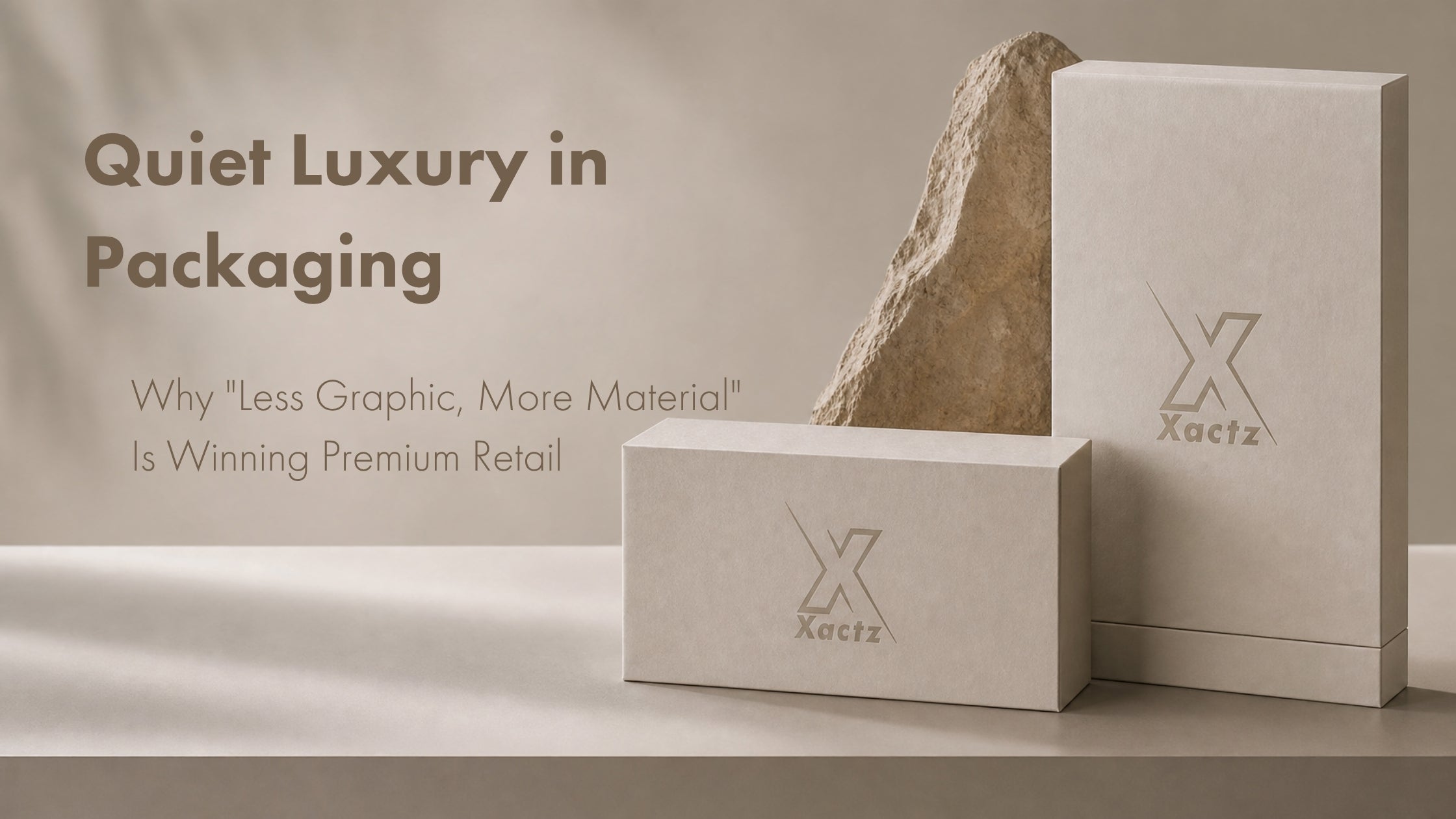
This is the core insight behind quiet luxury packaging: when you remove the graphic noise, the material itself becomes the message. A rigid box wrapped in a single uncoated paper stock, with nothing on its surface except a precisely placed blind debossed logo, communicates more about brand confidence and product quality than a box covered in competing graphic elements ever could.
The 2026 packaging design landscape confirms this shift. Ultra-clean industrial aesthetics, defined by blocky minimalism, muted palettes, and ergonomic clarity, have emerged as one of the defining trends of the year. Brands inspired by the precision and restraint of industrial design are stripping their packaging back to its structural and material essentials and finding that the result reads as more premium, not less.
The clearest examples of quiet luxury packaging in action come from the beauty and wellness categories, where the shift has been most dramatic and most commercially validated.
Aesop has built one of the most recognised luxury packaging identities in the world on almost no graphic content whatsoever. Brown pharmaceutical glass, minimal typography, and a complete absence of decorative graphic elements communicate a level of brand confidence that no amount of foil or print complexity could replicate. The packaging says: the product is the point.
Byredo operates on the same principle in the fragrance category. White or off-white boxes, single-colour typography, no illustrative elements, and a surface finish that rewards touch over sight. The unboxing experience is defined entirely by material quality and structural precision.
In the spirits category, brands like The Macallan have moved toward packaging that uses embossed texture, natural paper wraps, and restrained typography to signal heritage and craft. The graphic content is minimal. The material content is everything.
What these brands share is a willingness to let negative space, material texture, and structural engineering carry the full weight of the premium positioning. That willingness is now spreading rapidly across categories as brand directors and packaging buyers recognise that the quiet luxury aesthetic is not just a trend. It is a more honest and more durable way to communicate quality.
The consumer psychology driving quiet luxury packaging is directly connected to the broader cultural moment that Pantone identified in selecting Cloud Dancer as the 2026 Colour of the Year. Cloud Dancer was chosen as a response to collective overstimulation, a cultural desire for mental clarity, and a renewed appreciation for simplification and focus. As Pantone's Executive Director Leatrice Eiseman described it: the cacophony that surrounds us has become overwhelming, making it harder to hear the voices of our inner selves.
Premium consumers are applying exactly this logic to their purchasing decisions. A package that offers visual calm, tactile reward, and material honesty is experienced as more aligned with their values than one that competes aggressively for attention. Quiet luxury packaging does not shout. It invites. And in premium retail, an invitation is worth more than a shout.
Lightweight luxury is also emerging as a parallel trend in premium packaging design, with brands prioritising structural efficiency and the minimum amount of material and the simplest possible construction. This approach reduces waste, lowers shipping costs, and paradoxically increases perceived value by communicating that every element of the packaging has been considered and intentional rather than excessive.
The single most important design decision in quiet luxury packaging is paper stock selection. In a packaging system where graphic content is deliberately minimal, the paper becomes the primary carrier of brand personality and perceived quality.
The papers driving the quiet luxury aesthetic in 2026 share several characteristics. They are uncoated or lightly coated, which means they absorb light rather than reflecting it, creating a depth and warmth that coated stocks cannot replicate. They have visible texture, whether through natural fibre content, felt pressing, or embossed surface patterns, that rewards the hand before the eye. And they have weight and substance that communicates investment without requiring any graphic content to do so.
Soft-touch matte finishes, applied either as a coating to a standard board or as an inherent property of a specialty paper, are the most widely adopted tactile element in premium packaging right now. The velvety, low-sheen surface of a soft-touch matte box creates an immediate sensory signal of quality that consumers associate with the highest tier of luxury goods. It photographs exceptionally well, which matters enormously in an era where unboxing content drives significant purchase decisions. And it provides a neutral, receptive surface for the debossing and foil techniques that define the quiet luxury finish language.
Tactile and visual design is increasingly recognised as a direct sales driver in premium retail. Soft-touch coatings, heritage typography, and bold geometry give brands a shelf advantage that generic packaging cannot match.
If soft-touch matte finish is the canvas of quiet luxury packaging, blind debossing is its signature mark.
Blind debossing, the process of pressing a design element into the surface of a paper or board substrate without ink or foil, creates a recessed impression that is felt before it is seen. On a soft-touch matte surface, a blind debossed logo or pattern catches light at an angle, revealing itself gradually as the box is turned in the hand. The effect is intimate and considered. It rewards attention. It communicates that the brand has invested in craft rather than coverage.
The perceived value impact of blind debossing is disproportionate to its production cost. A rigid box with a single blind debossed logo on its lid reads as significantly more premium than the same box with a printed logo, even when every other element is identical. The reason is tactile: the debossed impression engages the fingertips in a way that print never can, and tactile engagement is one of the most powerful drivers of perceived quality in physical product categories.
Embossing, the raised counterpart to debossing, offers a similar premium signal but with a more assertive visual presence. For brands that want their mark to be seen as well as felt, a combination of embossed logo with blind debossed background texture creates a layered surface that rewards close inspection and communicates exceptional craft.
The colour palette of quiet luxury packaging in 2026 is anchored by Pantone Cloud Dancer 11-4201, the official Pantone Colour of the Year, and extended through a range of warm earth tones and natural neutrals that share its fundamental character of calm, restraint, and material honesty.
Cloud Dancer is described by Pantone as a lofty white that serves as a symbol of calming influence in a society rediscovering the value of quiet reflection. Its HEX code is F0EEE9, a warm off-white with the faintest suggestion of warmth that prevents it from reading as clinical or cold. It is a colour that recedes gracefully, allowing texture, structure, and finishing details to come forward.
In packaging applications, Cloud Dancer works as both a primary surface colour and as a base for finishing techniques. Soft-white folding cartons and rigid boxes built on Cloud Dancer-inspired stock with blind embossing or debossing deliver a packaging experience that is simultaneously modern and timeless. The colour pairs naturally with warm gold foil, which reads as refined rather than flashy against the soft white ground. It also pairs with blind debossing alone, where the absence of any colour accent creates the most restrained and most confident expression of the quiet luxury aesthetic.
The earth tone palette that extends Cloud Dancer in 2026 includes warm taupes, sandy beiges, terracotta derivatives, dusty sage, and deep warm browns. These colours share Cloud Dancer's fundamental quality of visual warmth and material honesty. They photograph well against natural surfaces, they pair naturally with uncoated and textured paper stocks, and they communicate the sustainability and craft values that premium consumers increasingly associate with genuine quality.
The most effective quiet luxury colour strategies in 2026 pair Cloud Dancer or a warm earth tone as the primary surface colour with a single accent in warm gold foil or blind debossing. This two-element palette, surface colour plus one finishing technique, is the defining visual formula of the quiet luxury packaging moment. It is simple enough to communicate confidence and refined enough to reward attention.
Packaging built around Cloud Dancer and its complementary earth tones conveys purity, calm, and modern craftsmanship, which is exactly what brands need to stand out on the premium retail shelf in 2026.
The choice between soft-touch lamination and textured specialty paper wrap is one of the most consequential finishing decisions in quiet luxury packaging. Both approaches deliver the tactile premium surface that the aesthetic requires. They differ significantly in their production characteristics, cost profiles, sustainability credentials, and the specific sensory experience they create.
Soft-touch lamination is a thin film applied to the outer surface of a printed board substrate during the finishing process. The film contains a matte coating that creates the characteristic velvety, low-friction surface associated with premium packaging across beauty, technology, spirits, and fashion accessories.
The primary advantages of soft-touch lamination are consistency and control. Because the soft-touch surface is applied uniformly across the printed substrate, it delivers a perfectly even finish across the entire box surface with no variation in texture or sheen. Print colours beneath the laminate are reproduced with high fidelity, which makes soft-touch lamination the preferred choice for packaging that combines quiet luxury surface quality with precise colour reproduction.
Soft-touch lamination is also highly durable. The film provides a protective barrier against scuffing, moisture, and handling damage that uncoated specialty papers cannot match. For packaging that will be handled repeatedly in a retail environment, or shipped through e-commerce channels where transit damage is a risk, soft-touch lamination offers a level of surface protection that specialty paper wraps do not.
The primary consideration with soft-touch lamination is sustainability. Traditional soft-touch laminates use a plastic film that compromises the recyclability of the board substrate. Water-based soft-touch coatings applied inline during printing are now available as a fully recyclable alternative that delivers a comparable tactile experience without the plastic film, making them the preferred choice for brands operating under PPWR compliance requirements or sustainability commitments.
Textured specialty paper wraps are applied to the outer surface of a rigid box or folding carton as a separate material layer, typically adhered over a greyboard or chipboard substrate. The paper itself carries the texture, whether through natural fibre content, embossed surface patterns, felt pressing, or linen weave structures.
The sensory experience of a textured specialty paper wrap is fundamentally different from soft-touch lamination. Where soft-touch lamination creates a uniform, frictionless surface, specialty paper wraps create a surface with visible and tactile variation. The texture is inherent to the material rather than applied to it, which gives specialty paper packaging a quality of authenticity and craft that laminated surfaces cannot fully replicate.
For the quiet luxury aesthetic specifically, textured specialty paper wraps are often the preferred choice precisely because their surface variation communicates material investment in a way that a uniform laminate finish does not. A rigid box wrapped in a linen-textured uncoated paper communicates craft and considered material selection. The same box with a soft-touch laminate communicates polish and precision. Both are premium. They speak different dialects of the same luxury language.
Textured specialty papers are also inherently more sustainable than laminated alternatives in most cases, as they do not require a plastic film layer and are more straightforwardly recyclable. FSC-certified specialty papers are widely available and provide the chain-of-custody documentation required for compliance with EU PPWR material transparency requirements.
The practical trade-off with specialty paper wraps is surface durability. Uncoated textured papers are more susceptible to scuffing, moisture marking, and handling damage than laminated surfaces. This makes them better suited to retail environments and gifting contexts where the packaging will be handled carefully, and less suited to high-volume e-commerce shipping where transit conditions are less controlled.
The decision between soft-touch lamination and textured specialty paper wrap ultimately comes down to the specific sensory experience your brand wants to create and the channel through which your packaging will reach the consumer.
For brands in beauty, cosmetics, and technology where surface precision and colour fidelity are paramount, water-based soft-touch coating delivers the quiet luxury surface quality with the consistency and durability the category requires.
For brands in gifting, fine food, spirits, and fashion accessories where material authenticity and craft are the primary brand values, a textured specialty paper wrap delivers a more distinctive and more memorable tactile experience that better serves the quiet luxury positioning.
For the highest tier of luxury packaging, the two approaches can be combined. A rigid box with a textured specialty paper outer wrap and a soft-touch laminated inner lid creates a layered material experience that communicates exceptional investment in craft and detail.
The quiet luxury movement in packaging is not a passing aesthetic cycle. It is a structural shift in how premium consumers read and respond to physical brand communication.
The brands that are winning premium retail in 2026 have understood something fundamental: in a world saturated with visual noise, restraint is the most powerful signal of confidence. A package that communicates through material quality, tactile finish, and structural precision rather than graphic complexity is a package that trusts its product and respects its customer. That trust is legible. Consumers feel it before they can articulate it.
The design elements driving this shift, premium tactile paper stocks, soft-touch matte finishes, blind debossing, Cloud Dancer and earth tone palettes, warm gold foil accents, are not expensive to execute relative to their impact on perceived value. They are available to any brand willing to make the shift from graphic complexity to material sophistication.
The brands that make that shift now will define the premium retail aesthetic of the next five years. The brands that do not will find themselves competing on price in a market that has moved on.
The question is not whether quiet luxury packaging is the right direction. The shelf is already answering that.
The question is whether your brand will lead the conversation or follow it.
Quiet luxury packaging requires a manufacturing partner who understands both the material science and the aesthetic precision that the trend demands. Soft-touch finishes that are perfectly uniform. Blind debossing that is crisp and deep. Paper wraps that are applied without bubbles, seams, or inconsistencies. Colour matching that holds across production runs.
Xactz manufactures factory-direct custom packaging across rigid boxes, folding cartons, drawer boxes, and specialty structures using premium tactile paper stocks, water-based soft-touch coatings, FSC-certified substrates, and precision debossing and foil techniques that meet the quiet luxury standard.
Know your specs. Know your aesthetic. Get your quote.
Visit www.xactz.com to explore our full range of premium packaging solutions and contact our team directly for a factory-direct quote tailored to your brand specifications and quiet luxury requirements.
By Xactz Packaging
Aug 16, 2026
By Xactz Packaging
Aug 13, 2026
By Xactz Packaging
Aug 12, 2026
